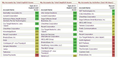
Enabling your sales team to succeed based on your marketing automation investments means ensuring that you can show them insights into their accounts and territories that they might otherwise not have been able to see.
An excellent way to do this is through the use of a "traffic light" dashboard that shows each salesperson, for their own territory, the hot, warm, and cold accounts that they own.
The use of a "traffic light" dashboard, to do this in green, yellow, and red has proven an excellent tool in many sales organizations as it allows salespeople to determine, at a glance, which accounts are showing buying interest.
 To set this up in salesforce.com is quite easy. I've included the salesforce.com instructions here, but a similar process for Microsoft CRM or Oracle CRM On Demand should also work.
The first step is to create a report that rolls up the individual lead scores of the contacts in an account to the account level itself. Note that to do this project, we're relying on you already having set up a good lead scoring process, with that data integrated into your CRM system.
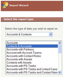
Build a report on "Accounts & Contacts" and select the "Contacts & Accounts" option to bring in data from both the contact (ie, their lead score), and the account (account name, etc).
When you are asked for a summary type, select a Summary report in order to allow us to aggregate the lead scores of each contact in the account into an overall lead score.
Although a sum of individual contacts' lead score is not the most perfect way of defining the exact score of an account, it does provide an excellent, directional view of which accounts are showing interest and should be contacted.
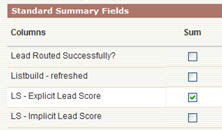 You will be asked to select your Summary Fields. Under Standard Summary Fields, select a Sum for your Explicit Lead Score field. This process can be repeated for Implicit Lead Score also, at a later point to build a second traffic light dashboard component based on buyer activity. Both implicit (how interested) and explicit (who) provided unique and valuable dimensions of lead scoring, and are worth dealing with separately.
With this sum field selected, you will be asked to select how to roll up your data. We'll roll it up by Account Name in order to show the aggregate lead score for each account in a rep's territory. Note that this view provides an account level overview of which accounts to talk with, and very elegently complements the sales insights provided by Prospect Profiler to give you a good detailed view of an individual's area and level of interest.
 The sort order of this column is not important as we will be changing this later for the dashboard.
The next step is to select the field that we are interested in. As we will be rolling up by account, the contact fields are not of interest and can be deselected. For account fields, select those that are of interest to you for a high level view, such as Account Name, Account Owner, and Industry.

Similarly, on the next step, the order of the columns can be selected in any way you would like. It will not affect the final dashboard, so order the columns as you wish.
Selecting your filter criteria now allows you to build a report that is unique to each salesperson for their territory. Whether you use account ownership, or more detailed data-level criteria to define an account ownership structure, you should be able to build an appropriate filter set to allow each salesperson to see accounts in their own territory.
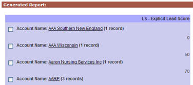 The one thing you will want to do on the filter page, under advanced settings, is to hide report details. This hides contact level details, and allows the report to only show the account level rollup of the overall lead score.
The display options on the next step are also not relevant as we will be showing this report in a dashboard, which will determine its own display settings, so just click Run Report to generate the report and verify that you have a rolled up lead score for each account in the target territory.
Save this report as we will use it to generate a dashboard from. You may again wish to create a similar report based on implicit lead score, and you will likely see demand from each of your sales reps for a similar report in their own territory, so you will likely end up with a series of these reports.
Now that we have a report created, the next step to tackle is to create the traffic light dashboard based on that report.
The common way to do this is to create a new, three column dashboard, and add in each view as a component with that dashboard to give salespeople a territory map to work from.
 When you have created a dashboard, add in a component to represent this report. Make the component a "Table" component type, and give it an appropriate title such as "My Territory's Accounts by Explicit Score".
Select the report you have just created as a source report in order to bring in the data on accounts with rolled up lead score. You will likely want to set the Sort order to "Row Value Descending" in order to show the highest scored accounts first, and usually a maximum of 25 or 50 values displayed keeps the report manageable.
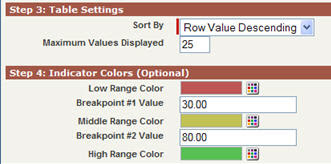 You can then set, based on your lead scoring ranges, where you want the traffic light colors to show. For example, if you have a 0-100 scoring range, you may want 0-30 as red, 31-80 as yellow, and 81-100 as green. You will find that this clearly shows why it is so important to define lead scoring caps and buckets so that scores do not get unweildy and are maintained within a workable range.
With that in place, you are ready to go. Save your dashboard, and work closely with your sales team to ensure that you have the right ranges identified, and the right way of defining territories to ensure that they are seeing the highlights of their own accounts.
Your sales team will be able to quickly discern which accounts are showing interested and should be called, and by doing so, will quickly become much more effective in their selling.


1 comments:
Hi Steve,
We've created these dashboards, and they are helpful. One issue that we are facing is that the accounts with the most contacts are often at the top of the list.
We're looking at further segmenting accounts in to buckets by number of contacts, use (HAT) High All-Time Score, etc. to help create apples-to-apple comparisons and identify accounts that are exhibiting sales-ready behaviors that we may have missed at a contact level. Any other thoughts on best ways to accomplish this goal?
Post a Comment