Showing posts with label marketing analysis. Show all posts

Monday, May 31, 2010

Justifying Adjustments – Saying Hello…Faster


(Guest post from Amber Stevens)

A few weeks ago, @heatherfoeh wrote about the value of a Welcome Program. This past November, the Eloqua marketing team launched our own version of a 3 touch – 30 day Welcome Program designed to engage prospects during the time when they’re known to be most receptive to giving and receiving info (according to MarketingSherpa study). Initial results were amazing with click-through rates reaching over 20% in some instances. But, like any good marketer, we know there is room to optimize. Here’s what we’ve learned along the way.

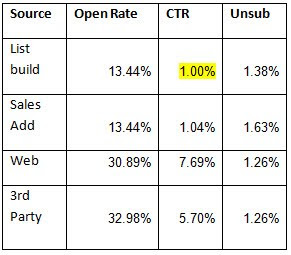
Unsolicited hello’s make you seem like a crazy person. This might seem obvious, but we got so excited with the initial results of the program that we started convincing ourselves that it made sense to welcome everyone. Conversion rates plummeted. Using the ‘Email Group Overview Grouped by Contact Field’ report (which is great for slicing and dicing email results) to sort on lead source, I combined similar sources and quickly realized that for us, welcoming acquired names through list builds and our sales team prospecting efforts drove the lowest CTR and the highest un-subscribes.

We stopped doing that.

It’s also important to note that when we run online events or promotions with outside vendors, we send one “bridge” email to follow up on the specific event or action they took, and then feed them into the welcome program. We had considered stopping this practice thinking that perhaps only those contacts who directly sought us out (ie came to the website) should be welcomed, but when we looked at the data, we realized we have great conversions from our 3rd party leads.

We’ll keep doing this.


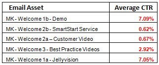
No one cares about “that guy” or your service pitch. Using the report ‘Email Group Overview’ I could see that conversions drop off drastically on both the second and third emails. Turns out, people LOVE the offers in the first email – but the second and third don’t drive a fraction of the conversions. Even when we swapped offers from a customer story (swapping male for female images had no impact) to our money back guarantee service, the second communication still gets paltry results. I think this has something to do with their buying stage – you wouldn’t necessarily care to learn more about services if you’re just window shopping. The third email achieves higher than average click through rates, but is still less than half as effective as the first email.

We’re going to revise the program and make it one touch – leveraging the highest converting offers (our Eloqua demo, fun intro to marketing automation and Best Practice Videos) – and minimizing other content by providing, but not over promoting.


So, as you can see, saying hello can take many different forms. The first step is to just get started – you can always learn and adjust along the way.

Please post your thoughts or questions on lead nurturing – I’m interested to hear what you’ve seen be successful.

Find me on Twitter @AmberSte

Friday, March 12, 2010

Reporting on sparkly clean data


(guest post from Mike MacFarlane @eloquamike)

===================================

In the year and a half that I have been working in Eloqua’s Marketing Operations team, one of the things that I have realized is that Marketing Automation is more than just “deploying an email”. Actually, it is much more than that.

Using Eloqua to really drive the alignment between our sales and marketing teams, I've realized how valuable it is to have absolute accuracy on any reports. This means, sometimes, I want to run a little bit of a cleanup routine on data before I report on it, rather than just running the out-of-the-box reports.

For our own team, this approach had started off a while back with managing how data came into our database and what we did with it once it entered. Enter the “Contact Washing Machine” – a program that I built within our own instance of Eloqua that helps to standardize and normalize key data that we segment and report off of. Once we were able to align our data, it opened up a world of possibilities in terms of the depth of reporting I could do (as well as how easily I could pull reports).

We wanted this confidence in the data to carry over to all our reporting, and I want to show you how we achieved that when we were building what we call our Activity Dashboard (there is lots of information in Eloqua’s Customer Central on how to build out your dashboard). The primary purpose of this dashboard was the help visualize exactly what was happening in our database – everything from total inquiries, inquiries by segment, inquiries by normalized title… the list goes on and on!

To get the ball rolling on this process, I created a very simple program in Program Builder which would help me to bucket active prospects into one group. We have various definitions of what an inquiry is, but for simplicities sake, I am going to define my inquiry as a form submission.

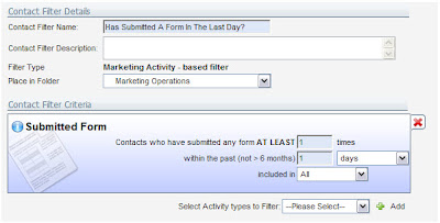
Step 1: I built an Activity Based Filter that evaluates any and all form submissions within the last day. This lets me get started with the set of data I'm interested in having a sparkly clean report on:


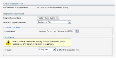
Step 2: I took my filter and added it as a feeder to my program (*note that activity filters only evaluate once a day). This technique lets me work with the data before I see it in a report, rather than use the out-of-the-box forms reports:


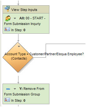
Step 3: The same step where I have my feeder setup, I also have a step action to add these people to a contact group. I'm going to report on the contact group members, rather than directly on the form submissions, so it allows me to do a little bit of data cleanup first:


You will notice above that after I add these people to a contact group, I evaluate to see if they are a current customer or partner of Eloqua – if they are, I remove them from the contact group that placed them in originally. The purpose of this is because I strictly want to evaluate inquiries from prospects. Any other cleanup and massaging of the data that you want to do before you report on it can be done here in this program. I'll just show this one cleanup step of removing customers and partner, but you can extend and elaborate.

Step 4: Once you have your contact group setup, you can start to build out all kinds of reports to place on your dashboard. For example, if you wanted to have a report that showed your inquiries by title, you could use the report called “Contact Field Values By Contact Group”. Simply select the title field in your database (or in our case at Eloqua, we use our Normalized Title field which is part of our Contact Washing Machine) and the contact group that is referenced within your activity program and run the report. The output looks something like this:


Steps 5: Next, you will want to add this report to your dashboard:


Your end result will look something like this - a very similar report to what you would have had out of the box, but now sparkly clean:


There are many other reports that you can add to your dashboard by simply utilizing this one, dynamic contact group so feel free to check out the Report Console within Eloqua. I would love to hear your feedback about how you are utilizing dashboards within Eloqua to help provide visibility on your marketing efforts, so feel free to leave your comments below.

Happy Marketing!

Wednesday, December 16, 2009

Filtering IP Addresses from Marketing Analytics


Today's post is a guest post from Leigh Oxley, Team Lead in Eloqua's product support group. She has been a part of the Eloqua Product Support team since 2006, supporting marketers in their quests for marketing automation excellence.

Based out of Eloqua’s Toronto office, she is currently focusing on high-priority initiatives to improve the support organization, as well as working directly with our partner eco-system by providing dedicated support to certified partners. Not only that, but she's great to work with, so if you want ideas, insight, or help on your next campaign, data project, or lead scoring initiative, give Leigh or her team a call, and they are always glad to help.

================================


I think we can all agree that testing is an important part of any project – ensuring that everything will work as expected from start to finish. One thing we often don’t consider though, is how the test data will affect our reporting metrics once the campaign goes live. For example, if you run an email campaign driving visitors to a brand new landing page, and you have a team of internal people testing all of the pieces, you will want each of those people to click-through from your email to the landing page. Once your campaign goes live, you will have a set of visitors who are only testers, and likely shouldn’t count towards your marketing metrics once you go live – you don’t want to report inflated numbers to your executive team!

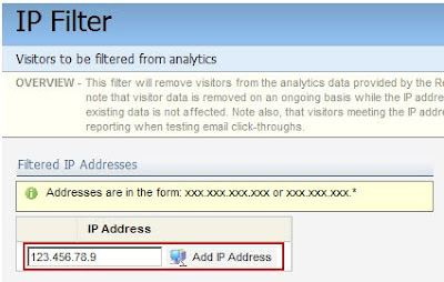
A quick and simple way to avoid this is to setup an IP filter within the Eloqua application, so that internal IP addresses are filtered from your analytics. As a Customer Administrator-level user, you have the ability to tell Eloqua “I don’t want to see visitor reporting on anyone coming from these IP addresses” through Setup -> Management -> System Management. This will simply disable tracking for anyone who visits your site from a list of IP addresses you define so that no web visitor information will be tracked. By setting this up for your organization, you can ensure that internal testers won’t be tracked and count towards your campaign metrics.


One question that clients often have when setting this up is how the functionality actually works. Essentially, when the website tracking scripts on your website pages see a visitor from an IP address you’ve configured to be filtered, they will ignore this visitor’s data. That means that if you later decide you want to track information for this IP address, you can simply remove it from the list and tracking will begin to take place. Something important to note is visitor data is removed on an ongoing basis while the IP address filter condition applies, but that existing data is not affected.

If I have a visitor profile with website visits reported from yesterday, and my IP address is added to the list today, then removed tomorrow, there will be a one-day gap in the reporting for my visitor – while I’m on the list, no web activity will be tracked. Another important point is that this does not affect other reporting for the contact, only visitor website activies are affected; all form submissions, program history, email sends, email opens, are still tracked as normal, but email click-throughs (as these are web activity) will not be tracked.

Hopefully this helps you to maximize your reporting efficiency in Eloqua and ensure you’re reporting the truest information to your teams. If you would like to set this up for your organization, there is a step-by-step interactive checklist available here in Customer Central to walk you through.

Monday, November 23, 2009

Analyzing the Overall Success of a Lead Nurturing Program


With lead nurturing programs, we'll often use many pieces of content over a many month period in order to capture the attention of prospective buyers. Each of the emails used can be analyzed individually in order to understand its effectiveness, but we often want to look at the overall lead nurturing program to understand whether any of the content caught the attention of prospects within the program.


There's a very easy way to do this, a tip provided by Heather Foeh (@heatherfoeh) in our customer succes team. At the end of your marketing automation program, use a decision rule to split the contacts into two streams - those who did click through emails in the program, and those who did not.

This is much easier to do, of course, if the emails are kept organized, either through an email group, or through being part of a campaign. Then, the activity filter can quickly be built to identify which emails you are referring to.


This decision rule splits the flow of your program into two almost identical steps - they both remove the contacts from the program. The only difference between the two steps is how they are named.

The reason to do this is to make the reporting and analysis easier. When you analyze your program using either a Program Funnel Exit History report or a Program Funnel Motion report, the two different steps will clearly show the number of contacts who did or did not click on emails in the overall program.


This overall analysis is excellent for allowing you to understand and manage the results of your lead nurturing program in aggregate as you work to keep your prospect community engaged.


Monday, November 16, 2009

The Evolution of Marketing Measurement


One of the panels at Eloqua Experience that was very much worth watching was the panel discussion between Paul Teshima, Eloqua's SVP of Customer Success, and three of the industry's top CMO's and marketing leaders - Chris Boorman of Informatica, Drew Clarke from Cognos/IBM, and Tom Miller from ADP.

Some great insights came out of this panel as they each showed how they are measured, how they measure their teams, how they build their marketing dashboards, and what they are doing about measuring new media and the effects of social media.

The conversation is divided into parts so you can skip to the section of most interest to you. I hope you enjoy the insights from these leaders as much as I did:


The Evolution of Marketing Measurement Part 1: Paul Teshima introduces the panelists and the topic of the marketing metrics that matter and building the CMO dashboard.


The Evolution of Marketing Measurement Part 2: The four key elements of marketing analysis are introduced - Campaign ROI, Funnel Health, Strategic Segment Analysis, and Benchmarking - and a discussion on "How are you measured today?" starts.


The Evolution of Marketing Measurement Part 3: The question of "How do you measure your marketing effectiveness?" is discussed by the panel, and the three marketing leaders show their own dashboards (Chris Boorman and Drew Clarke)


The Evolution of Marketing Measurement Part 4: (continuation) The question of "How do you measure your marketing effectiveness?" is discussed by the panel, and the three marketing leaders show their own dashboards (Drew Clarke)


The Evolution of Marketing Measurement Part 5: (continuation) The question of "How do you measure your marketing effectiveness?" is discussed by the panel, and the three marketing leaders show their own dashboards (Tom Miller)


The Evolution of Marketing Measurement Part 6: Open questions regarding percentage of pipeline that marketing is expected to contribute, and how data is maintained across the entire lifecycle of a lead in the marketing process.


The Evolution of Marketing Measurement Part 7: Open questions on measuring buzz from social media and its effect on search and SEO, as well as measuring brand equity vs revenue.


The Evolution of Marketing Measurement Part 8: Open questions on measuring influences of marketing in deals rather than just sourcing.


Thursday, September 24, 2009

Eloqua Experience: Highlights from 2008 - Fred Waugh, Convio


Eloqua Experience 2009 is just around the corner. Coming to San Francisco on Nov 2nd - 4th, 2009, this is the event of the year for any marketer focused on marketing automation and demand generation. We’ll have 3 tracks this year; a “Rising Star” track for those just getting up to speed with campaigning, lead scoring, lead nurturing, and sales alignment, a “Rock Star” track for those who are looking for cutting edge ideas on understanding, communicating with, and facilitating buying processes, and an “Executive Insights” track for those leading marketing organizations and looking to transform their businesses.

Topping it all of is the Markies Gala on Tuesday night, where the industry’s best marketers will be celebrated in 12 categories. If you have not yet written up your Markies submission, the deadline is fast approaching on Friday, October 2nd so you’ll want to submit soon.

In preparation for this year’s event, I wanted to highlight a few of the presentations from last year that I thought were particularly interesting. Not only are the ideas shared in these presentations still highly relevant today, but most of the marketers you hear in these presentations will be back at Eloqua Experience this year as veterans, and you will have a great opportunity to talk with them and get their advice and insights into not just how they re-engineered their businesses as discussed in these presentations, but how they have grown from there in the past year.

Today’s highlight is Fred Waugh, VP Marketing and Alliances at Convio. Convio is a leader in software for non-profits, and as such they serve a very broad base of customers, ranging in size from local food banks to the American Red Cross, and in their focus, ranging from libraries to cancer foundations.

In this presentation, Fred walks through their transition in Sales and Marketing alignment, from a “Field Marketing 1.0” perspective, to their current state. The presentation is rich in metrics, and ways of analyzing the Marketing pipeline.

Some highlights from Fred's Sales and Marketing Alignment Presentation (use the “Chapters” tab to quickly jump through the presentation):

5:03 Marketing 1.0
Fred discusses their previous state, what they were measure on, and how they tied closed/won business back to marketing’s influence.

14:00 Model Sensitivity
Fred looks at the sensitivity that their models had to changes in assumptions on close rate and what that did to drive the need for more leads in Marketing.

20:12 Report Card
A comparison of Convio data to benchmarks from Sirius Decisions

22:21 Pipeline Contribution
A full report of funnel data all the way from marketing through to sales, based on the quarter in which an opportunity was created


I look forward to seeing you all at Eloqua Experience 2009 in San Francisco, and I hope you will all submit your Markie award submissions before next Friday.

Tuesday, September 1, 2009

Quick Tip: Dashboard Pop-Outs


One of the most powerful ways to ensure the your marketing organization adopts a culture of analytics is to focus heavily on building great dashboards. One very quick tip that some users of Eloqua dashboards may not be aware of is the Pop-Out function.

For the sake of keeping your dashboards clean and clear, many tabular reports are automatically truncated to 10 or 15 rows. This is great for clean viewing of an overall dashboard, but can be problematic if you are looking to do a deeper dive into trends that are below your top 10.

If you want to dig in further than the top 10, you'll need to see a full list. Whereas you could easily see this in the report console, there is an easier way with dashboard pop-outs.

Under the "Actions" menu, select "Pop-out Report", and you will pop that report out into its own window, giving you a full screen to work with (useful for larger reports such as visitor lists), and allowing you to go beyond the top 10 or 15 rows.


A lot of thought can be put into what you include on your dashboards, and it's an area that I recommend reading up on. Tim Wilson has a great post on the art of dashboard design and development to get you started on his Gilligan on Data blog.

A well crafted dashboard can give your team great insights into your overall marketing efforts and their success, and when presented to your executive team, can alter their overall thinking about the investments you need to make in marketing.

Thursday, August 27, 2009

Better Marketing Analysis Through Dynamic Filters


When you run a report within Eloqua, you will often want to understand a bit more about the data that you have within the report. Whereas you can easily export the data for secondary analysis in a tool like Excel, often the easiest thing to do is to dynamically filter the results of your report to get the view you want.

This is easy to do from most list reports (ie, a list of visitors, or a list of contacts).

In the top menu, under Filter, select "Filter these contacts" and you will be presented with a window that lets you define a filter. That filter is applied dynamically to the report you are looking at, letting you quickly see a subset of your data.

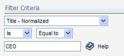
For example, if you had a list of contacts who had submitted a web form for a download, and wanted to understand how effective that marketing campaign had been at targeting CEOs, you might add a filter for "Title = CEO". Note, however, that the need for a contact washing machine becomes very clear in doing this. If we have not managed the data quality of our incoming title data, it will be hard to define a good filter. However, if the data has been standardized and normalized, we can work with a normalized Title field that can be easily filtered.

With the "CEO" filter layered on to our results, we can quickly see whether the campaign has been effective at generating responses from top execs. The filters can be quickly and easily removed or changed, which lets you work with any list report to get a better sense for the data it contains.

Dynamic filters on reports are a quick but powerful tool for getting better insights out of your marketing data.


Tuesday, August 18, 2009

Insights on Data Quality from Contact Group Dashboards


Understanding your data is one of the most critical things to do as a marketer. Data is a foundation for everything you do; lead scoring, segment definition, content personalization, lead routing, and marketing analysis. Without good data, each of those tasks will be challenging if not impossible.

One of the most powerful tools in understanding your data is the contact group. It lets you build almost any cut of data that you want. Most simply, this can be done with simple group overlap rules that show people who are in group A, but not group B for example.

A slightly more advanced technique is to combine groups and filters to perform robust group manipulation to create a combination of activity and data as a driver for a group definition. This process can be further automated using a marketing automation program to dynamically create a dashboard based on group membership.

With each of these techniques, you are provided with a one-click dashboard of the group. By selecting "Contact Group Dashboard" from the menu, you get a full suite of interesting reports showing you what is happening with that group and the contacts in it.

One of the most interesting reports in this dashboard is the Contact Field Completeness report. This report shows you, based on a view, how complete the fields are in contacts within that group. Each field is shown as being between 0 and 100% complete, giving you good insight into whether you have data to work with for the set of contacts in your group.

However, more interesting than this, is the results you get by clicking on a field of interest. For example, if we click on the "Title" field (98.2% complete), we can see that the data within that field is from a manual text field as it is obviously free form.

A quick look at this data gives you a good sense of whether it is of sufficient quality to build rules upon.

Using this dashboard to quickly understand your data gives you a very quick sense of where you are at and what areas you need to work on in terms of data quality.

Armed with this understanding, you can quickly tune your contact washing machine to best optmize the data that you have and the data that you need. With cleansed and normalized data, building segmentation rules, lead scoring rules, content personalization rules, and marketing analysis becomes significantly easier.