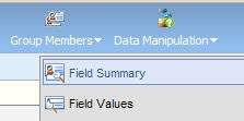
 The quick and easy way to profile your data is to get a sense of what is in each field. You can do this from any Contact, Prospect or Company Group, and it gives you an overall sense of the consistency and quality of your data.
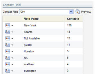
 First, create a group that contains the people you are interested in working with (one technique for defining group membership using overlap is talked about here: http://eloqua.blogspot.com/2008/12/defining-segments-using-group-overlap.html). From there, use the "Field Summary" option in the top menu. This brings up a window where you can choose the field that you wish to profile.
 You can profile any field in your data model, and you will see a result that shows the values in that field and the frequency (ie number of contacts) in which that value appears.
Note that you will only be able to profile fields where there is some consistency of data - if there are over 1000 different distinct values, this method will not work.
It's a great habit to get into to do a quick sanity check of your data any time you build a process that relies on it. Data quality is a key foundation for many marketing processes and strategies, and the more you focus on it, the more you will build in processes to ensure that data quality remains high.
If you find that data profiling highlights some data issues, you might find the following useful; a common strategy that many marketers employ in handling their data quality is the Contact Washing Machine described here: http://digitalbodylanguage.blogspot.com/2008/12/contact-washing-machine.html


1 comments:
You can also create dashboards to display the same field data in a graphical format. I use this for for lead scoring dashboards where you can breakdown the data for A rated leads. For example, show me the breakdown of the lead sources for A rated leads vs. B rated leads.
Post a Comment